The Replay™
The Replay™ by VideoAmp transforms sports tournament viewership data into a series of bold, dynamic, story-led reports, starting with March Madness, revealing who the viewers are and the stories they tell through how they watch.
Deliverables
Role
year
industry
Project Overview
Introduction
The Replay™ by VideoAmp is a series of digital reports that transform tournament viewership data into bold, story-led experiences, starting with the March Madness Report. Designed to scale, each report highlights who’s watching, how they’re watching, and the larger story the data reveals.
VideoAmp’s goal was to go beyond traditional reporting by creating something that felt as dynamic and exciting as the games themselves, making complex audience insights easy to digest and visually compelling, while showcasing the power of their proprietary data. More than just a one-off concept, The Replay™ was envisioned as a flexible and scalable system that could support an ongoing series of sports-themed reports throughout the year.
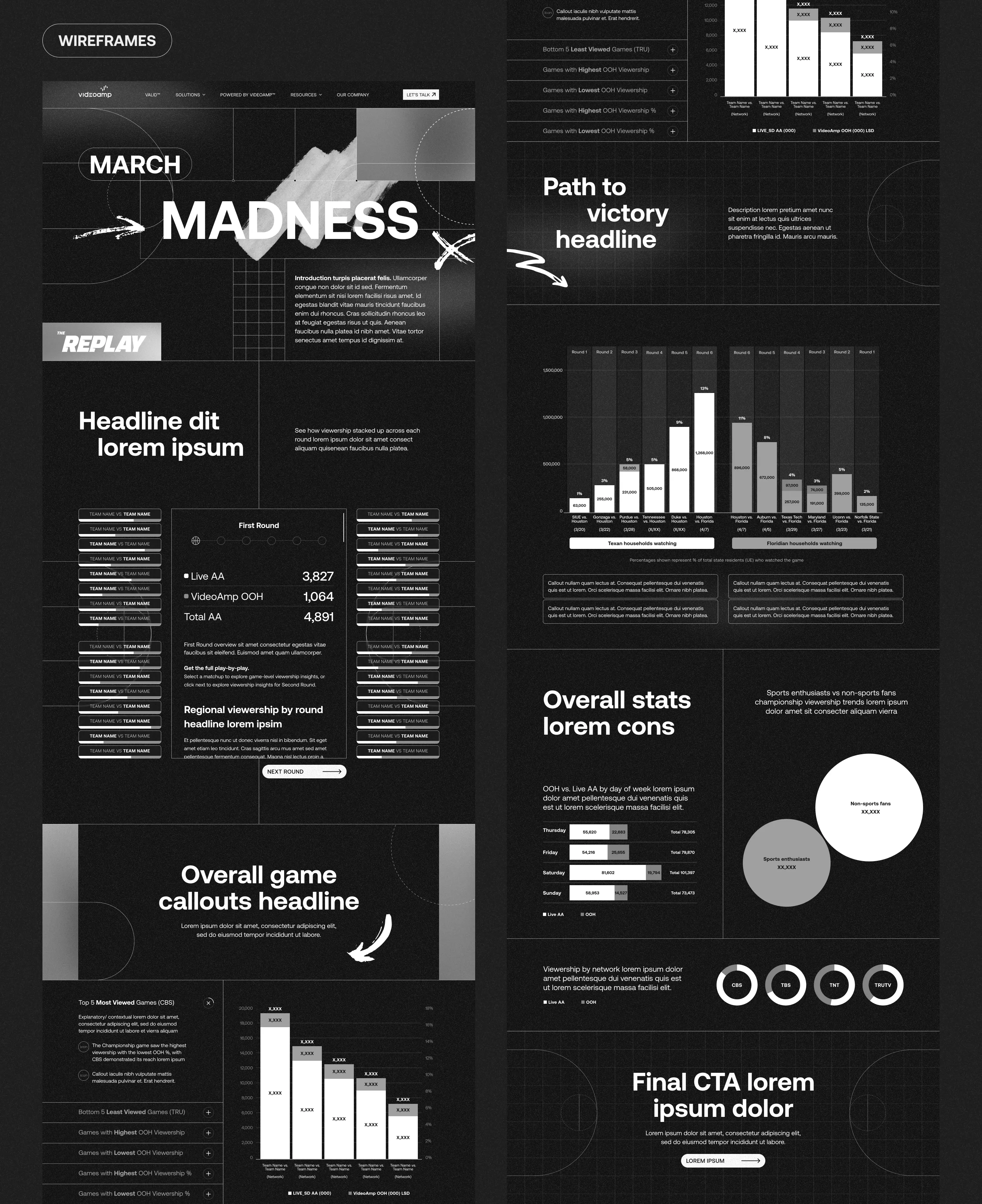
As the Senior Web Designer on this project at Column Five Media, I led the digital design for The Replay™. With the visual identity and logo designed by C5’s Art Directors, my role was to translate the system into an interactive experience that made complex data feel simple, dynamic, and enjoyable to explore. From early wireframes to final UI, I worked closely with our developer, internal team, data strategists and the team at VideoAmp to bring the experience to life.
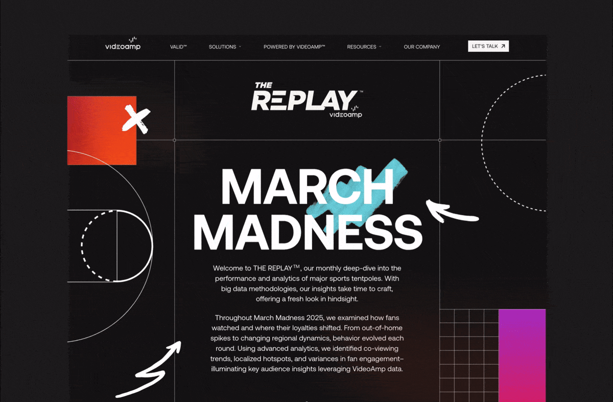
March Madness
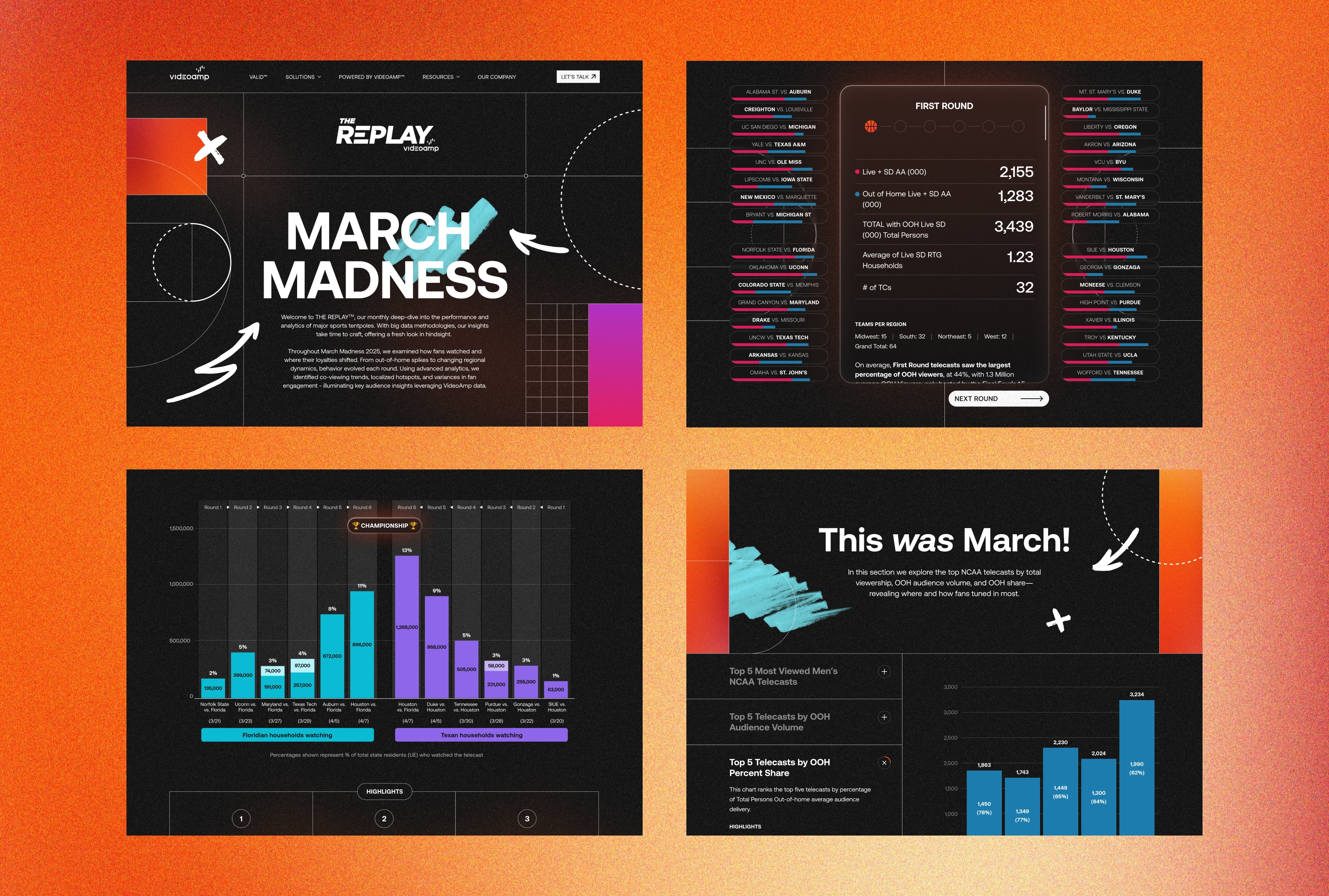
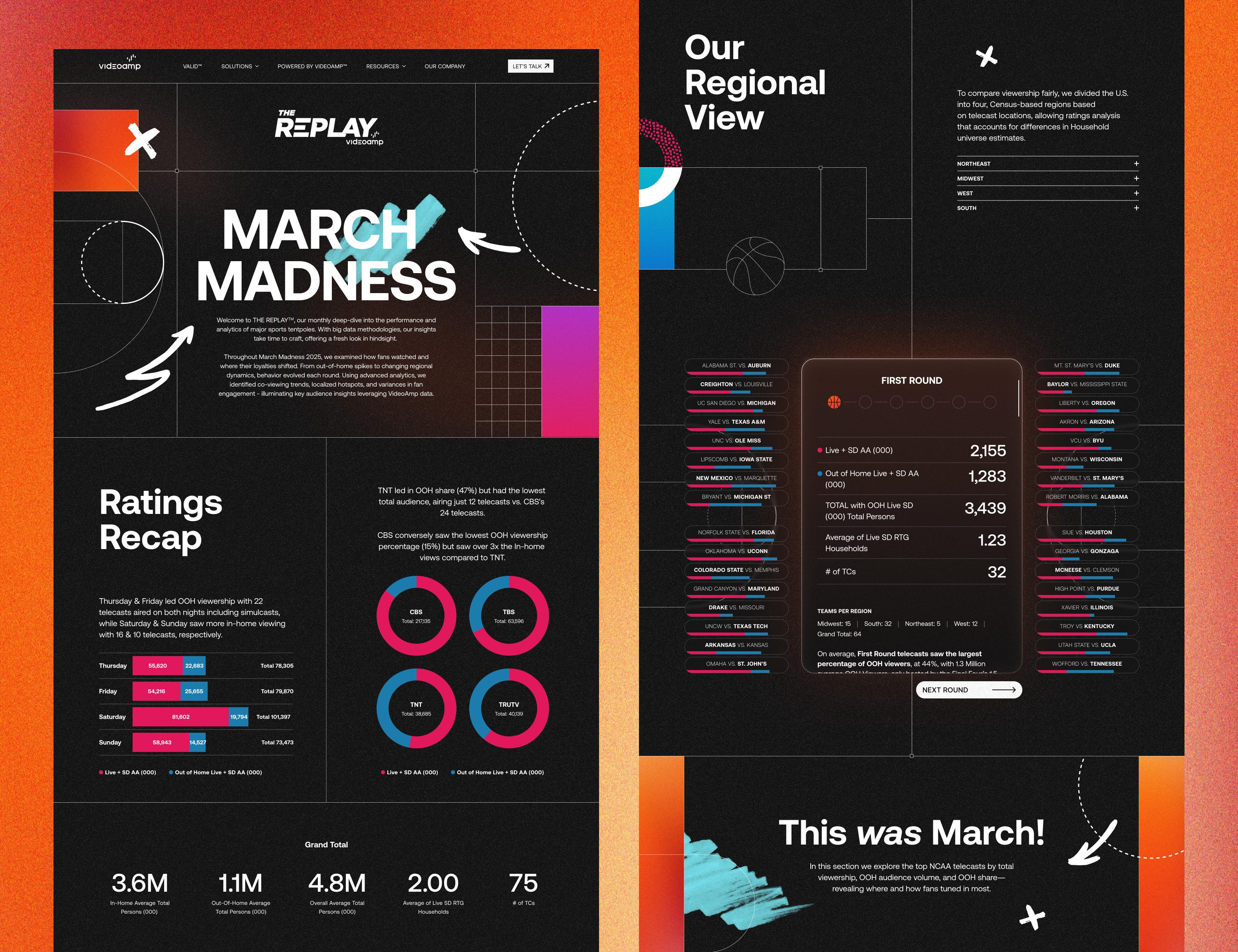
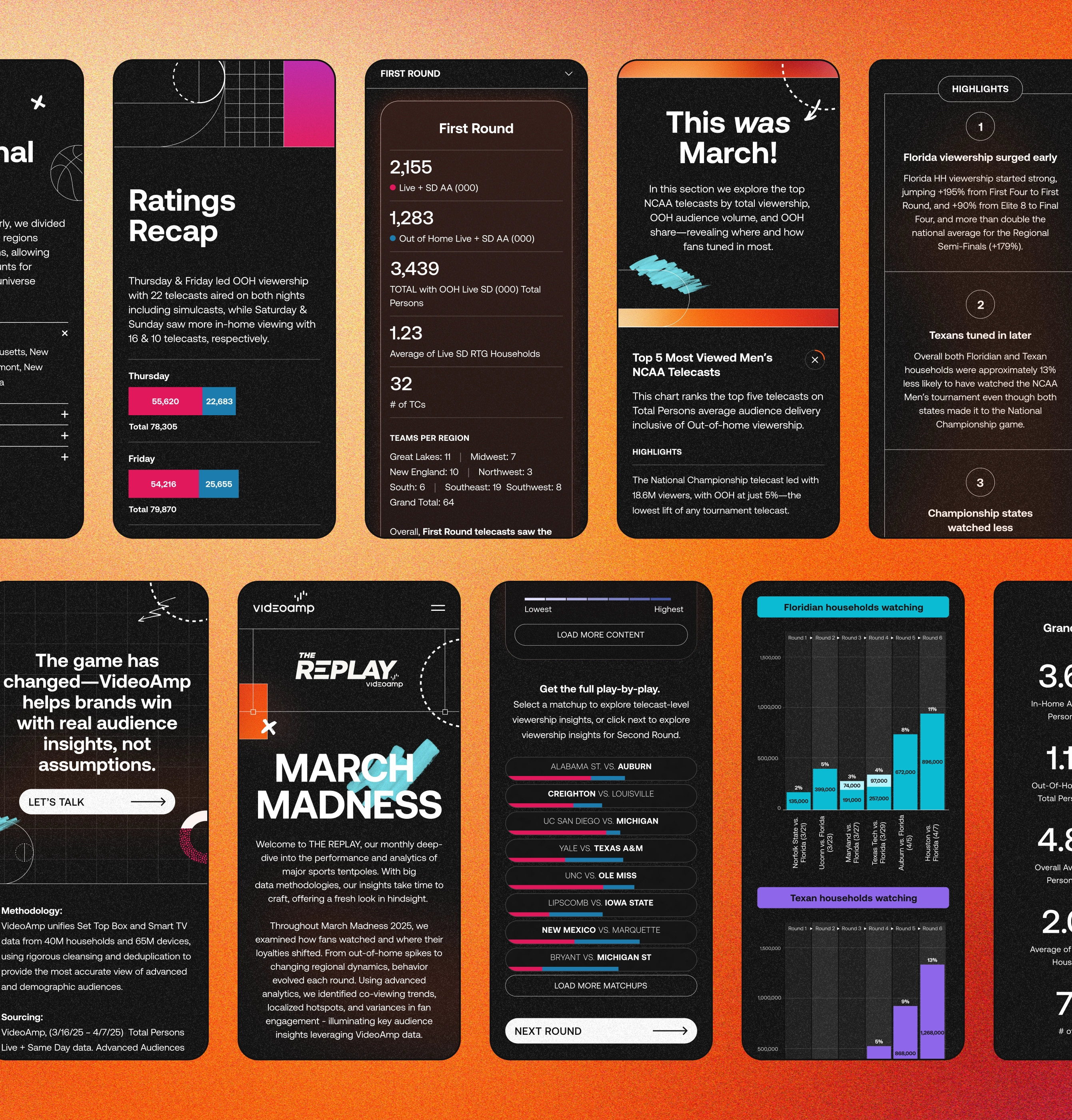
The March Madness Report was the first in the series, built around a large volume of tournament viewership data. The challenge was to distill these complex datasets into clear, story-led moments that felt fun to explore. Each section was designed to be scannable at a glance, with interactive elements like a clickable bracket section, tooltips, and animated reveals offering deeper layers of insight without overwhelming the user at first. Basketball-themed visuals, scroll animations, and playful Easter eggs captured the energy of the tournament while keeping the experience both intuitive and engaging.
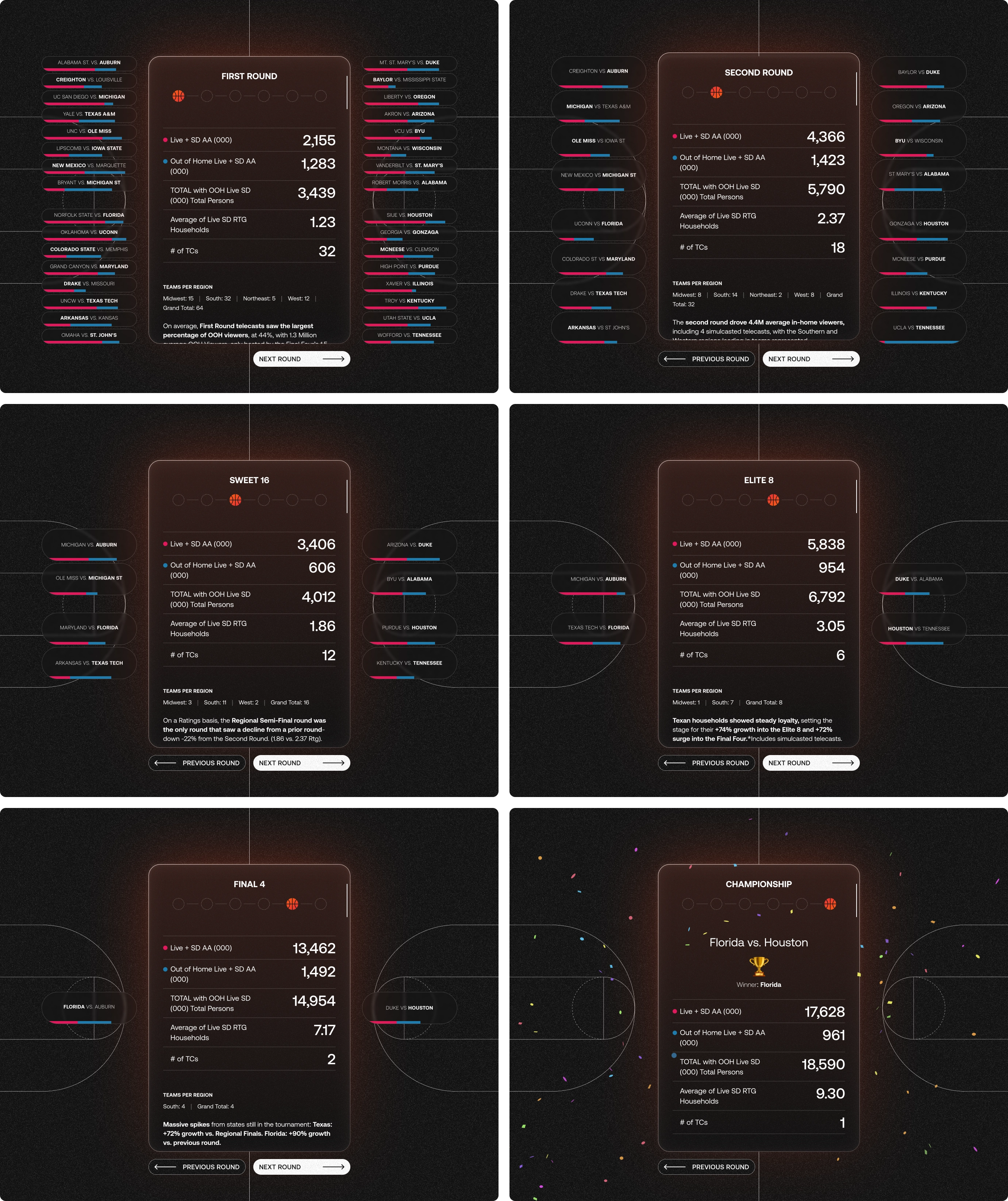
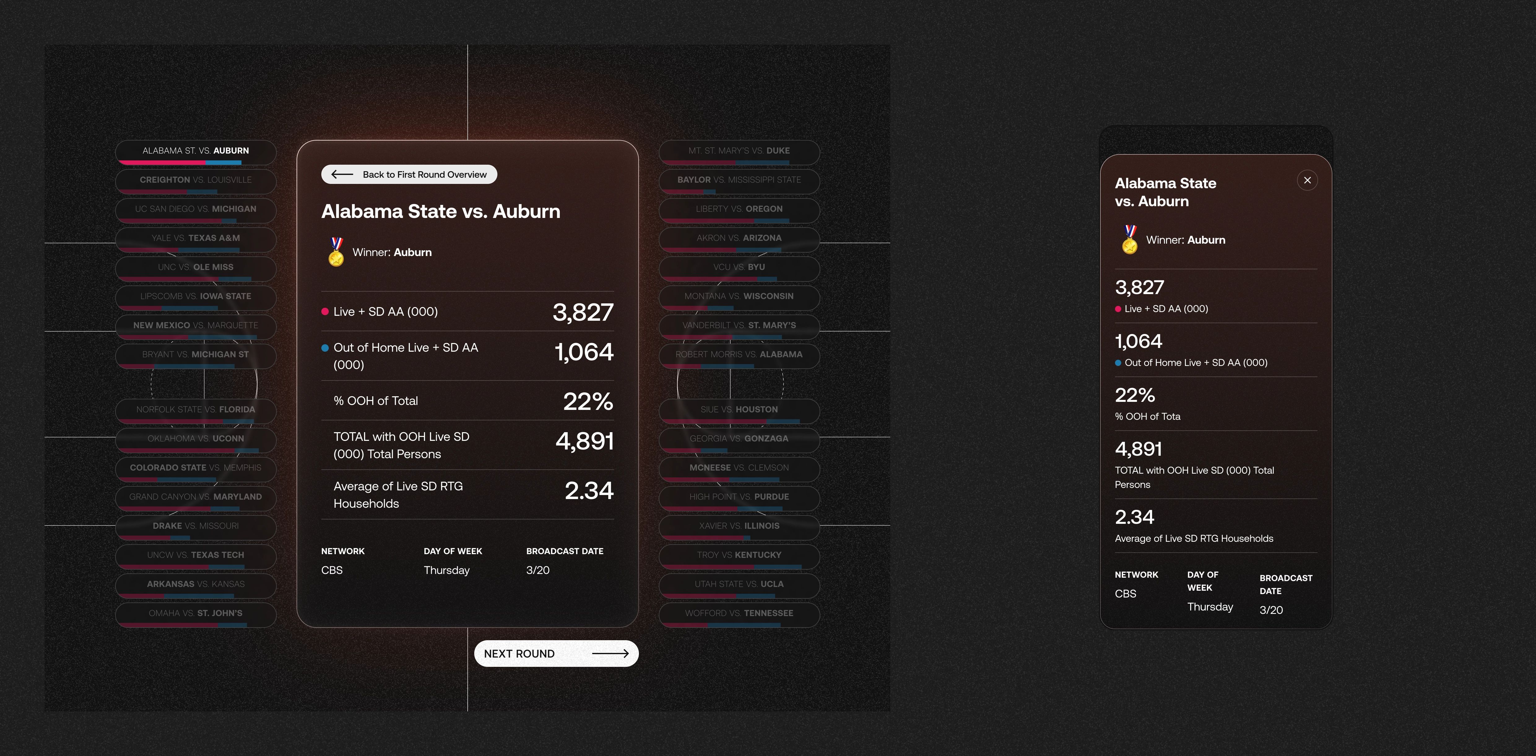
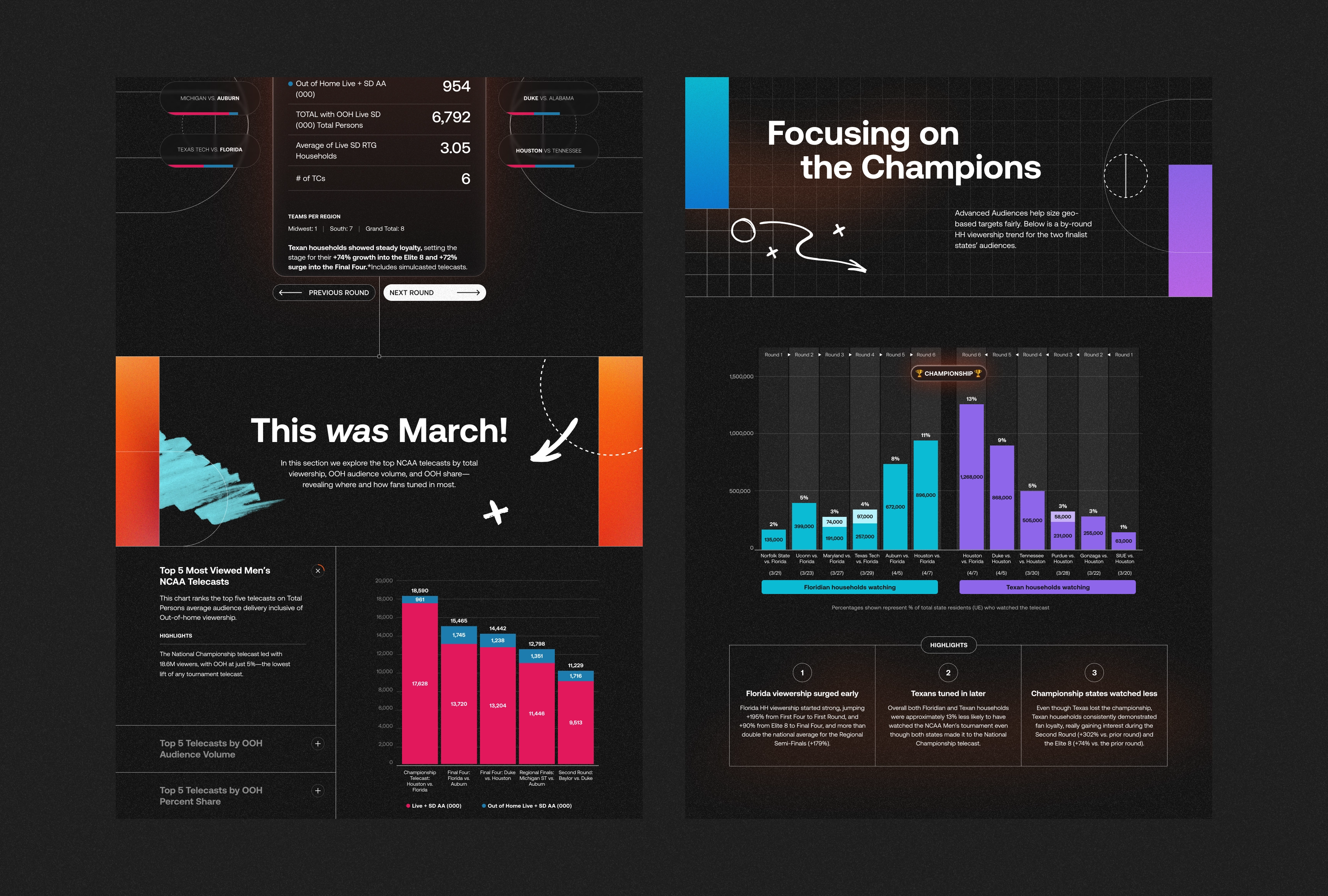
The interactive bracket section serves as the centerpiece of the report, providing a high-level view of viewership insights and highlights across each of the six tournament rounds, along with clickable matchups for game-specific breakdowns. This balance between macro and micro level insights gave the bracket both functional clarity and a sense of discovery.
March Madness Bracket
The interactive bracket was designed to showcase a comprehensive view of tournament viewership insights, highlighting both overall data for each round as well as viewership data for individual matchups. At the center, a scrollable card provides a high-level summary of viewership data for the round, paired with key highlights that bring the data to life. Users can navigate through rounds using a clickable timeline or previous and next buttons.
Surrounding the central card, individual matchup cards represent each game within the round. Segmented bars show in-home (AA) and out-of-home (OOH) viewership for quick comparison across games. Hovering over a card reveals exact numbers, and clicking updates the central card with a view of that game’s viewership insights. This setup encourages exploration by allowing users to move smoothly between broad round-level trends and specific game insights.
Designing the bracket meant finding the right balance between clear presentation and engaging interactivity, all within a scalable layout. The bracket’s layout adjusts naturally as users navigate forward, reducing matchup cards round by round until only the championship game remains, marked by an animated confetti celebration.
Let's talk.
